Creative Direction
Creative Direction
A Bold New Direction, Built to Scale
A Bold New Direction, Built to Scale
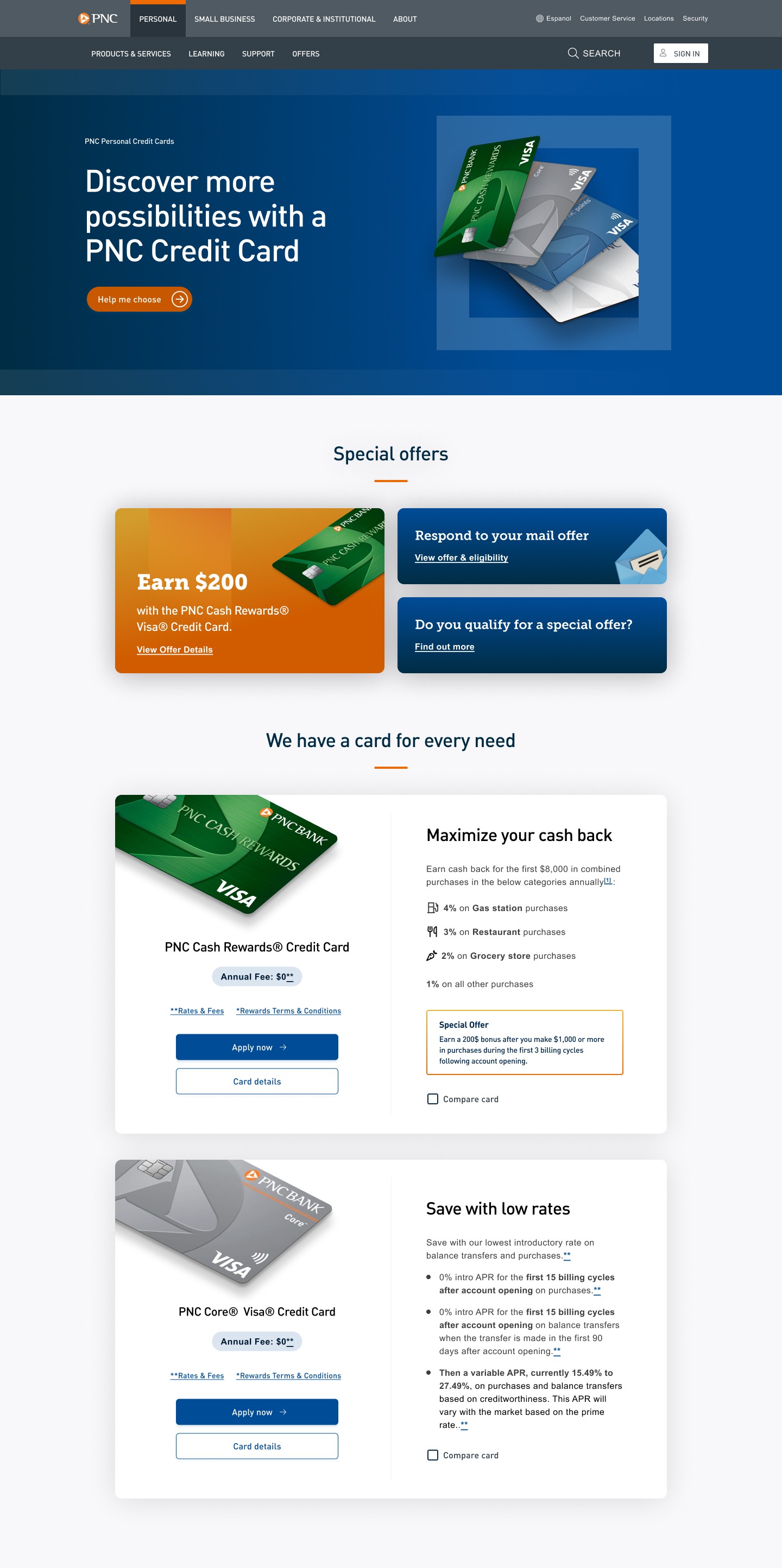
I reframed PNC Bank Canada’s digital creative direction, evolving the visual design for a more compelling, customer-ready experience.
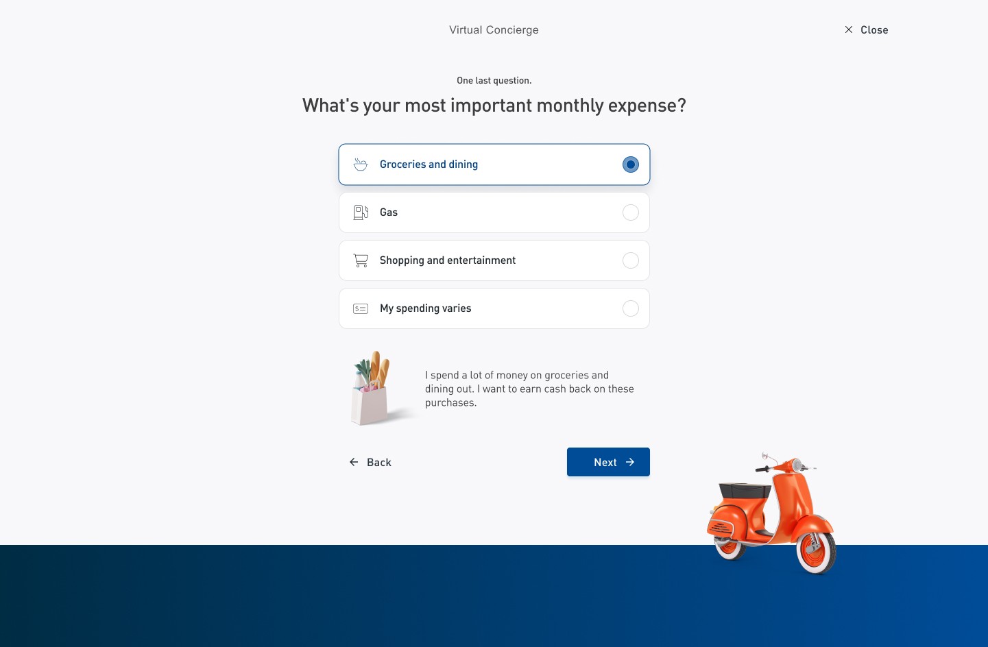
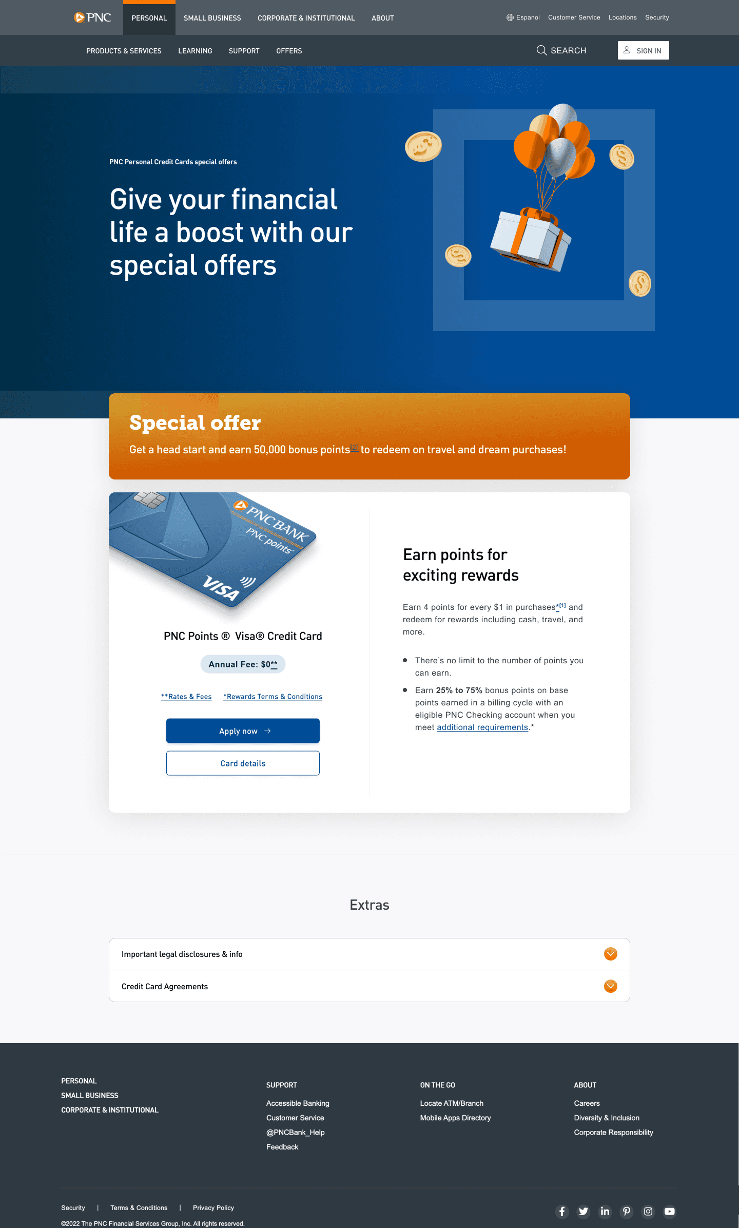
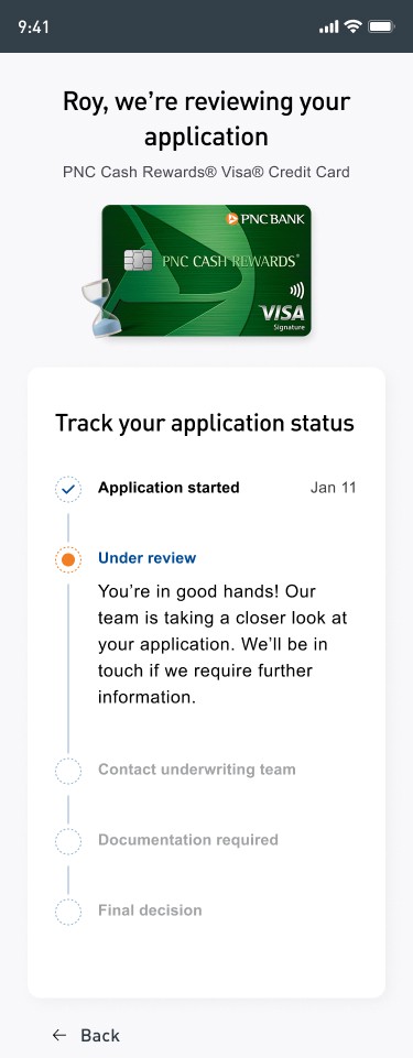
Through focused sprints, I prioritised key pages, refreshed the design system and introduced motion—delivering bold gradients, illustration and a more distinctive digital presence.
I reframed PNC Bank Canada’s digital creative direction, evolving the visual design for a more compelling, customer-ready experience.
Through focused sprints, I prioritised key pages, refreshed the design system and introduced motion—delivering bold gradients, illustration and a more distinctive digital presence.
Approach.
Mood board
3 days
Creative direction
Competitor analysis
2 days
Design review
PNC Bank in Canada were creating a new website. While happy with the UX they felt the UI would not resonate with users. I was tasked with delivering a new direction.
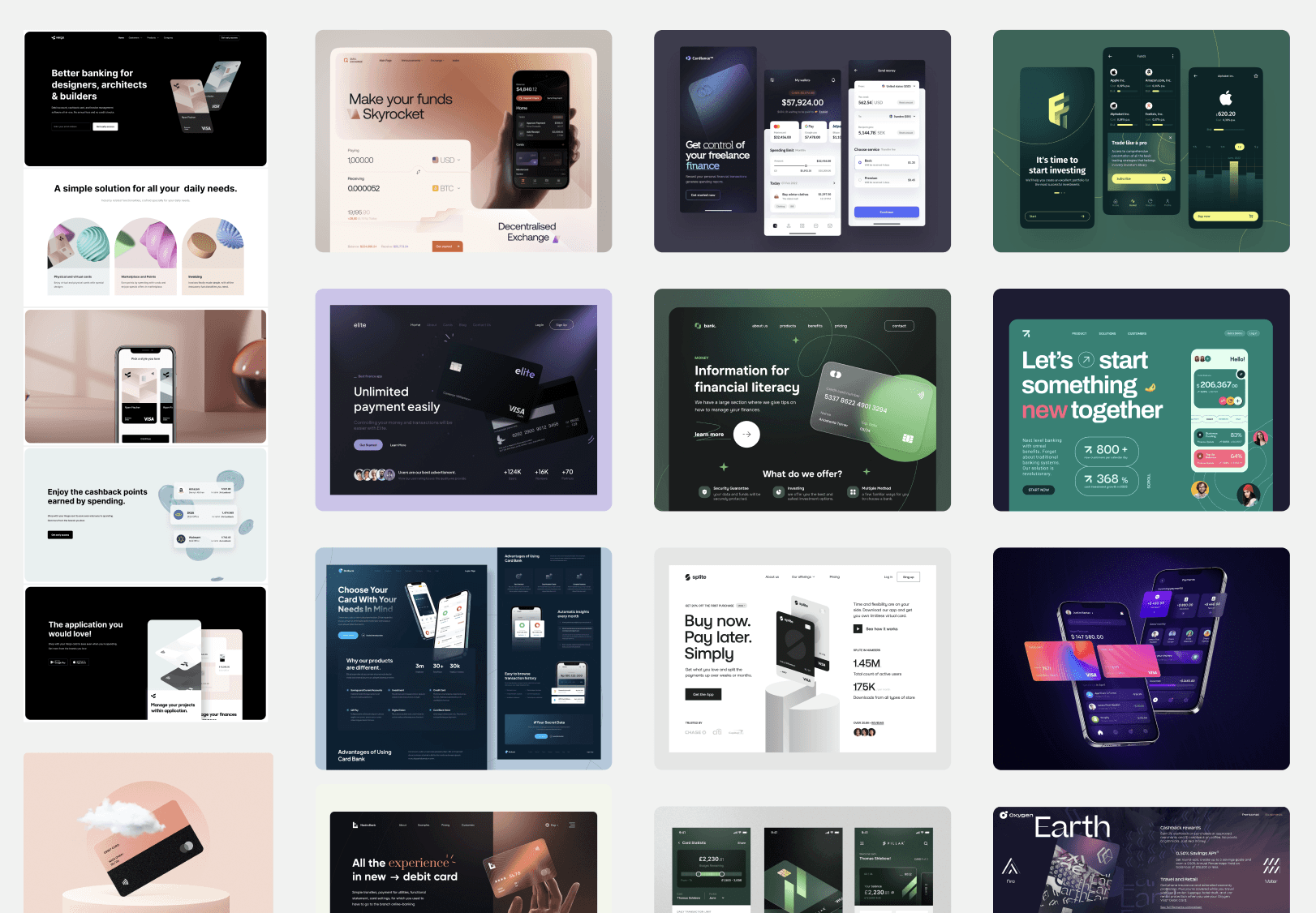
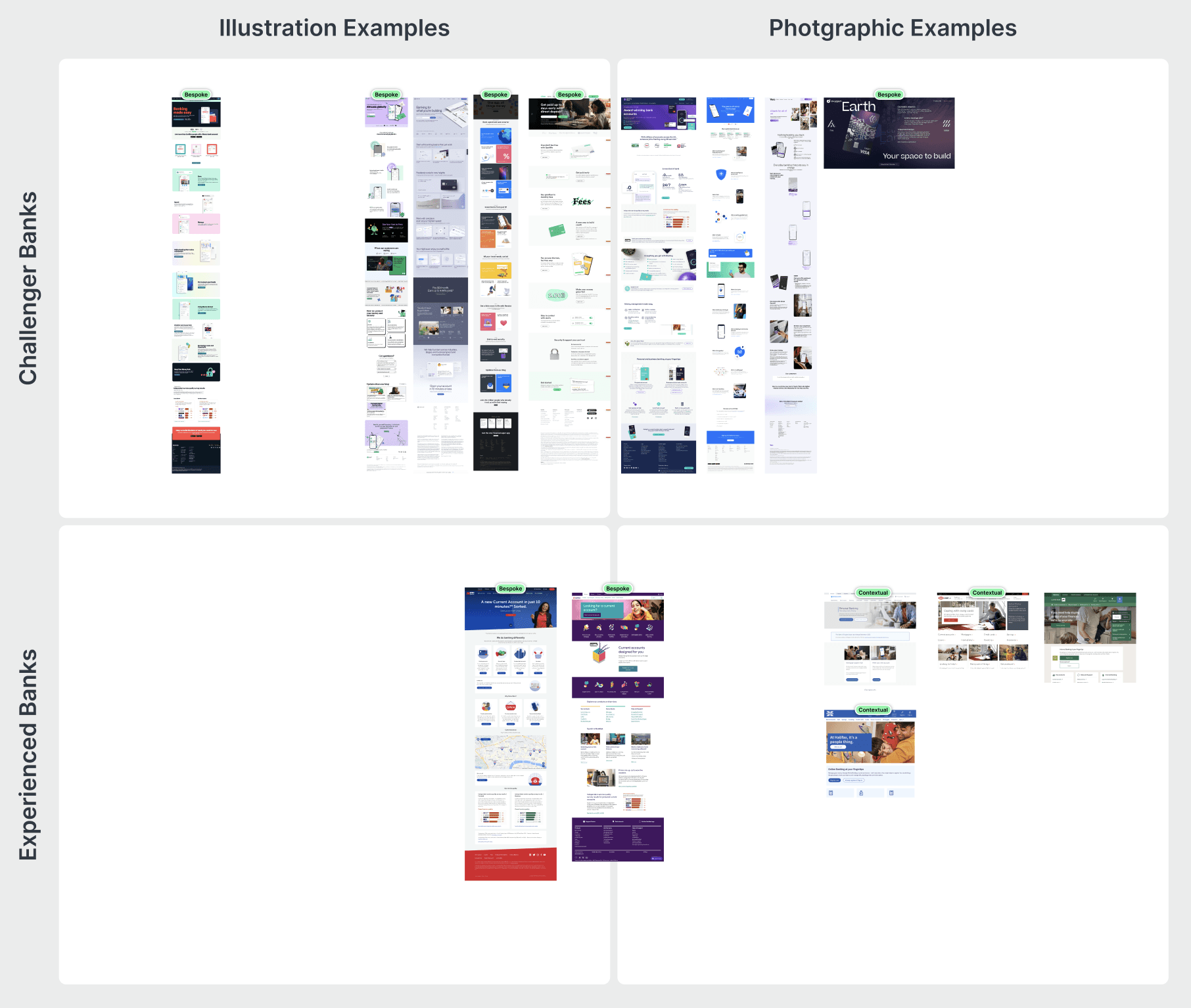
I compared traditional banks to newer challenger banks, exploring more vibrant colours and looked at a different approach to illustration.
PNC Bank in Canada were creating a new website. While happy with the UX they felt the UI would not resonate with users. I was tasked with delivering a new direction.
I compared traditional banks to newer challenger banks, exploring more vibrant colours and looked at a different approach to illustration.
Execution.
Sprints
3 x 2 weeks
Design System
Motion Design
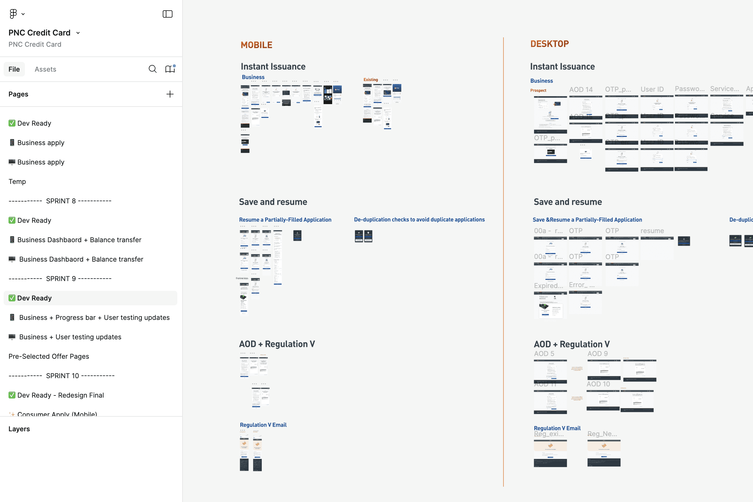
There was a lot of work to update in only a few weeks. I needed a strategy that delivered the highest impact, without redoing everything.
Key pages were prioritised for greatest impact. Then the larger scale of changes were made with efficient use of design system updates. Finally animation was added to core components and demonstrations were prototyped.
There was a lot of work to update in only a few weeks. I needed a strategy that delivered the highest impact, without redoing everything.
Key pages were prioritised for greatest impact. Then the larger scale of changes were made with efficient use of design system updates. Finally animation was added to core components and demonstrations were prototyped.
Designs.
The end result introduced an attention grabbing aesthetic with bolder gradients, illustrations, rounded corners and smooth drop shadows.